1. User Experience Principles
The following are basic experience principles to design and develop a service or a product for consumers.

People ignore design that ignores people. Our job is to create experiences driven by a deep understanding of our customers. This should be achieved using data and user research.

Design with the broad, end-to-end customer experience in mind to create a consistent service. Everything a user sees, hears and touches should feel consistent and on-brand.

To accomplish business goals and answer the users’ needs, test every design solution with real users. Decisions should be made based on knowledge driven by insights & data, not opinions or assumptions.

An experience should be tailored to meet the unique needs of the individual, based on a specific situation. Providing contextual solutions according to where the user is in the journey will deliver an accurate service.

Digital products should constantly evolve and adapt to users’ changing expectations and needs. This is an ongoing, iterative process of refinement. Aim to increase usage metrics, hit KPIs and achieve the business goals.
2. User Interface Principles
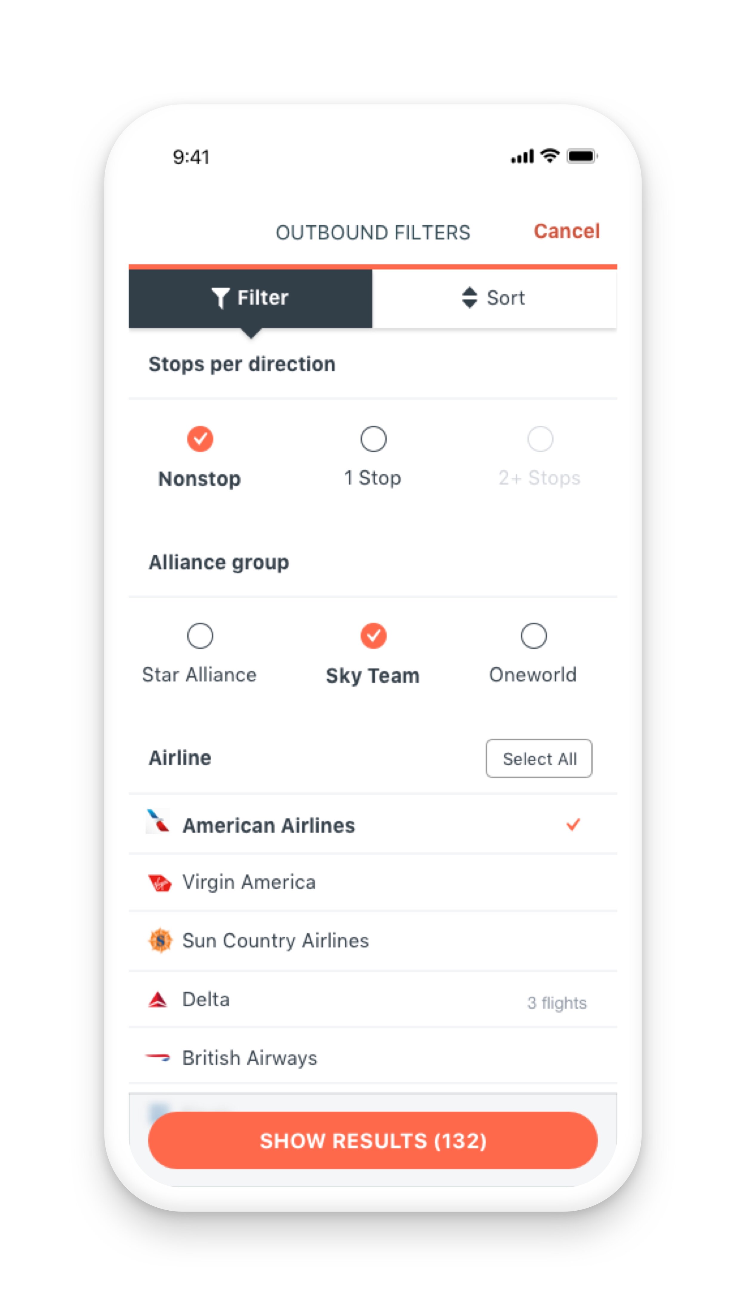
Typography, symbols, colour and other static and dynamic visual elements are used to convey facts, concepts and emotions. Use these elements to build an information-oriented, systematic visual that helps users understand complex information. Successful visual communication through information-oriented, systematic visual design relies on the key principles listed below. Always focus on anticipating what users might need to do and facilitate their actions by designing interface elements that are easy to access, understand and make sure that the interface design is aligned with the following accessibility WCAG 2.0 AA standards.

1.
Provide a consistent experience regardless of the access channel or device
When the application’s capabilities differ on other devices, it creates a negative impact on user experience and may result in low satisfaction and loss of trust in your product. Always ensure that users have a similar experience regardless of how they interact with the product or which devices they use.
2.
Make sure that the interface elements have a clear meaning
Avoid abstract interface elements the users can’t understand. Users should not have to wonder what these elements do.
3.
Direct the user to the preferred action
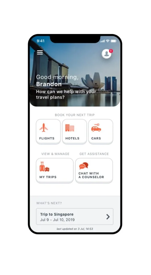
The users will feel more comfortable when they understand what action they are supposed to take. Design the preferred action of each screen to be the most prominent element. Users should never wonder what to do next—the preferred action should be the focus and very clear.
4.
Place controls in the context of object the user can control
Keep things easy and clear for the users — if an interface element can be edited, changed or controlled in any way, place those controls right next to it.
5.
Design default values that users want to keep
Users will rarely change default settings - for example, most of the people have a default background and ringtone on their phones. So whenever designing default values, such as preset settings, make sure that they are as useful and practical as possible so the user will keep them. The user should not feel compelled to adjust or change the default values.

6.
Provide clear and constant feedback to the users to make them feel confident
The more the interface communicates action to the users, the more confident the users will feel making actions. Provide a clear notification for every action users take. This makes users feel in control and gives them confidence to use the product again.
7.
Keep the interface elements consistent
Elements that behave the same should look the same. Don’t give the same visual treatment to elements that behave differently.

8.
Strive to have one primary action per screen
Every screen you design should support a single action of real value to the user. This makes it easier to learn and use. Screens that support two or more primary actions are confusing. Screens with a single primary action can have multiple secondary actions but they need to be less prominent than the primary action. Do so by making the secondary actions lighter visually or show them after the primary action has been taken.

9.
The appearance of interface elements must be consistent with their behaviour
Users expect the interface elements to behave a certain way based on the elements’ appearance. For example, if the element looks like a button, it should act like a button. Form follows function. The user should be able to predict how an interface element will behave just by looking at it.

10.
Break a complex action to smaller steps
When designing forms with many fields, split the form into several steps and show an indication of the user’s progress. This will make the user experience less overwhelming and easier to manage. If you give the user a sense of accomplishment, they will feel encouraged to complete tasks.
11.
Organise your content strategically
Organising your interface will help users understand it more easily and quickly. Create inherent relationships: Group like elements together and show relationships of elements by how you place and orient them. With strategic organisation, users won’t have to think about how elements are related.

12.
Create clearer interfaces by showing only what is necessary on each screen
Present the user with just enough information to make a choice, and then dive into details on a subsequent screen. Progressively disclose information as necessary; don't show everything at once.
3. Motion Principles
Motion in user interface is used to convey functionality, and intention with delight and fluidity. Great motion should support the user's orientation and act as a guide. It is used to establish hierarchy and draw the user’s attention to essential elements, giving them an understanding of an object’s role within the design. In order to convey this, the motion needs to be quick, direct, and precise.
Motion brings personality, tone, rhythm, and purpose to otherwise static objects. When applied properly, motion goes unnoticed. It should feel like a well choreographed dance, with all of the elements acting and reacting to one another simultaneously.
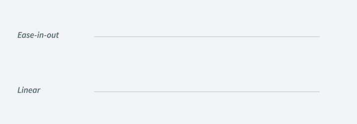
Easing
Motion should mirror movements we encounter in the physical world around us. Use ease-in-out curves for the majority of animations: Start slowly, accelerate through to the middle, then decelerate through to the end. Don't create linear movements; they are unnatural to the human eye.

Time
Movement should be slow enough so the user can recognise what's happening but fast enough that it doesn’t make the use wait. Most UI animations last between 100 and 300 milliseconds. If users will have to experience a long animation every time they interact with commonly used UI components, they'll get frustrated. If a motion feels like it is calling attention to itself, tone it down.

Page transition
Use animation when relevant; not every page transition requires animation—only when supporting the content and flow.
Mobile - When moving to next page on mobile, use OS's default transitions
Micro-Interactions
Use subtle animations to enhance interactive content.
Entertaining motion
There are specific moments when it’s okay to use motion just to entertain. Investing in innovation and crafting even the smallest details, can make all the difference. It can bring personality to an experience and create a positive emotional connection. Even the tiniest gesture can make a product feel alive and enjoyable to use.